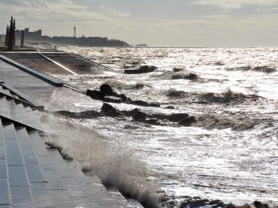
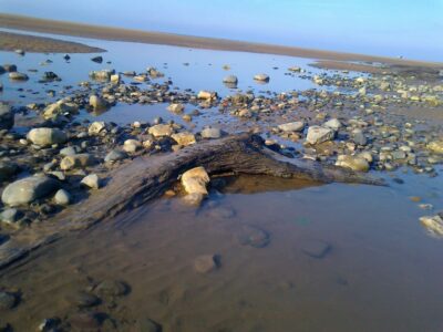
No, we’re not psychoanalysing it! But understanding the beach is vital in ensuring that our coastal towns don’t get flooded. Work is done on a rolling basis to measure and record how it changes. Interested? Here’s what happens –
If you’re a frequent visitor to the Fylde Coast, you may recall seeing someone walking up and down the beach in straight lines. They wear high-visibility and carry a strange pole with a disc on top (just like the one below!). These people appear twice per year, usually once in winter and again in summer. But what exactly are they doing?

This is Joseph Earl. He’s a PhD student at Lancaster University and he’s working with Visit Fylde Coast on Coast Watchers. Joseph has written this article. There’s more about the Coast Watchers project here.
You might also be interested in this video, which shows you around profile 3. It also explains how University students monitor it for their degree programme.

Enjoyed this video? Why don’t you subscribe to our Visit Fylde Coast YouTube channel – make sure you don’t miss out!
Surveying the Beach
Chris is one of the engineers at Wyre Council.
‘I like to tell people that we’re surveying for a new airport runway’, Chris jests as we trudge through the thick, wet sand at Knott End one cold March morning. ‘Or that we’re measuring the nuclear fallout from Heysham, that’s usually a good one!’
FREE Newsletter
FREE Newsletter

Accustomed to the curiosity and questioning of passing dog walkers and ramblers, Chris likes to get creative with his responses, but he is, of course, doing neither of those things. (And he does tell people what he is really doing!)
Miles of walking
Instead, he’s surveying the beach, a bi-annual process that involves miles and miles of walking up and down beach ‘profiles’ to help understand how the beach is changing over time.
I joined Chris for a single beach survey in March 2019, and it’s certainly tiring work. I’ve since gone on to analyse some of this data for Cleveleys beach. This article will share some of these findings with you:
- providing a brief introduction into where the profiles are,
- what the data shows
- and how it’s used by the managing authorities.
Understanding the Beach Profiles
A beach profile is a straight line that extends from the landward side of the beach, all the way down to the sea. In this case, from the concrete sea wall at Cleveleys.
There are lots of profiles on the Fylde coast, spaced roughly 500 m apart. You can’t see the lines on the beach, as they only exist on a map. You may have noticed numbered markers fixed to the promenade and wondered what they are for? They indicate the starting position of each profile, with the marker number corresponding to the profile number.
For example, the marker for profile 3 is positioned on Cleveleys prom between the Venue restaurant and the large rock groyne. See it at the left of the next photo –


These photos explain more fully exactly how profile 3 is used when surveying the beach.

Image Sources:
- Google Maps (2020) Cleveleys. Available at: https://www.google.co.uk/maps/@53.8807452,-3.051802,1701m/data=!3m1!1e3!5m1!1e4 [1/12/20]
- View from Café – Joseph Earl
How are the profiles measured?
The process of surveying the beach is largely automated. People are still required to get out on the beach and walk along the profile.
The long pole has a GPS antenna & receiver attached at the top of it. It’s carried along the profile from the sea wall to the shoreline. A data logger is attached midway along the pole and tells the surveyor where to stop and take a measurement, which is usually every few metres.
You may also have seen a quad-bike or drone in action too. This helps to speed up the process! The measurement records the height (in metres) of the beach above or below sea level. Repeating this twice per year gives a good indication of how the beach profile has changed in height over time.
How Much does the Beach Change?
What do these measurements look like, and how much does the beach actually change?
What does the data show?
The beach changes quite a lot over time. In fact, it changes every day as a result of wave and tidal processes. So surveying the beach every six months can pick up rather large height variations along each profile.
This change can be plotted in graphs, from which we can calculate beach volumes and other parameters like Momentary Intertidal Coastlines (MICLs)…. Hang on a second, we’re getting a little technical here! Let’s go back to the basics –
Imagine an OS map, stretched out across the table. Looking down on the flat map from above does not provide an accurate reflection of the texture and contours of the land. It’s only when we get out into the open and we realise quite how steep say, a footpath is that we appreciate the lay of the land.
Cross section
It’s the same with standing on the beach. We can only see the top layer of sand and shingle, so measuring heights along the profile allows us to slice a cross-section through the beach. Then we can understand how the elevation varies over the beach width. Let’s picture this for profile 3:

The chart shows the height measurements for profile 3 as recorded in March 2011. The solid yellow line is the beach profile itself. From over 5 metres above sea level at the sea wall (top right), down to almost 5 metres below sea level at the shoreline.
The yellow line is the beach surface, the part that you can walk on and see, as demonstrated by the stick person (not to scale). The line may look extremely steep in places and not a reflection of reality. That’s because the scale has been compressed here, so we’re looking at roughly 700 metres of beach from seawall to shoreline. I have put the dotted yellow lines on the diagram to show the cross section of the beach. The area between these lines and the surface indicates the beach volume for the profile.
Sandbanks and channels
There are also more interesting things going on in the above diagram.
Imagine that you’re standing on Cleveleys prom on a lovely sunny day looking out to sea when the tide is out (see the label marked ‘sea wall’ in the diagram).
The gravely, shingle beach in front of you is steeply angled, but the sandy beach beyond it looks largely flat. We can see this in the diagram, with a steep yellow line showing the shingle beach (green label), which spans around 50 m, and the flatter line below the stick person showing the flatter sandy beach (yellow label).
However, when you look out across the sandy beach, you also notice that the beach is not entirely flat, there are crests and toughs. Again, the profile line reflects this variation. This is the bar network on Cleveleys beach – the sandbanks and channels which often catch people unawares as the tide comes in. It’s something I will write about in future articles.
Understanding the Beach Trends
As I mentioned, the beach changes over time. If we plot nine years’ worth of profile surveys on a single graph, it looks like this:

At first glance, this looks very confusing and messy. Each coloured line represents a different profile measured on different dates between April 2008 to October 2017.
The two red lines show the maximum and minimum beach height across the whole profile during this time period. The greater distance between the two red lines, the greater the height variation over time for that part of the beach. We can see this in the centre of the graph.
Big changes, little changes
Where the red lines are far apart, there is over a two-metre change in beach height! This is the sandy beach, which constantly changing due to the waves and tides. It’s something which you will have noticed if you walk on the beach regularly, as the ridges and troughs on the beach move daily.
However, look at the shingle beach below the promenade at the top of the graph, and the red lines are closer together. This means that there’s been less change in height over the time period.
As a result, over long time periods, the upper shingle beach is more stable than the lower sandy beach. The shingle may sometimes be washed away during storms and powerful waves, but this graph shows that it re-builds and recovers quickly. There’s not as much height variation between the different profile lines.
Why is this Data Useful?
Beach surveying is an essential piece of the complex puzzle of understanding the beach and how it changes over time.
Such work can help to show erosion (beach loss) or accretion (beach gain) over time. It can indicate the success or failure of beach management schemes and coastal defences. It can even be used to predict storm impact.
So, when you’re next on the beach and you see people walking in straight lines carrying funny poles, they are certainly not searching for King John’s lost gold. They’re more than likely just surveying beach heights. I’ll let you decide which one is the more valiant quest!
Data used in this article is sourced from Wyre Council.
How you can join in!
You might have seen our new project called Coast Watchers. It’s a partnership between Visit Fylde Coast, the engineering team at Wyre Council and Lancaster University.
We’re collecting photos to create a daily record of how the Fylde Coast changes over time. The next step is to tie it to lots of interesting data… loads more to come!

Why don’t you upload your photos? They don’t need to be anything specific or clever – just add them to the gallery.
While you’re here…
Have a look at the homepage of the Visit Cleveleys website for more of the latest updates.
Love the Fylde Coast? Sign up for your weekly email newsletter. Packed full of interesting things it arrives in your inbox all 52 weeks of the year.
Join us on Facebook at our Visit Fylde Coast Facebook Group
Don’t forget to follow us on Twitter @visitFyldeCoast

We Need Your Help
We Need Your Help